The New Language of Color in Whole-Home Design
Why Color Is Architectural, Not Decorative
When we begin designing a home, color is never the final decision. It is one of the first.
In whole-home projects, color shapes how architecture is experienced long before furnishings arrive. It influences how light moves across a space, how millwork reads against stone, and how one room transitions naturally into the next.
Rather than being applied at the end, color works alongside materials from the beginning — informing cabinetry tones, plaster finishes, wood stains, and upholstery. When considered this early, it becomes part of the structure of the home itself.
In thoughtful residential design, color is not decoration. It is architecture.
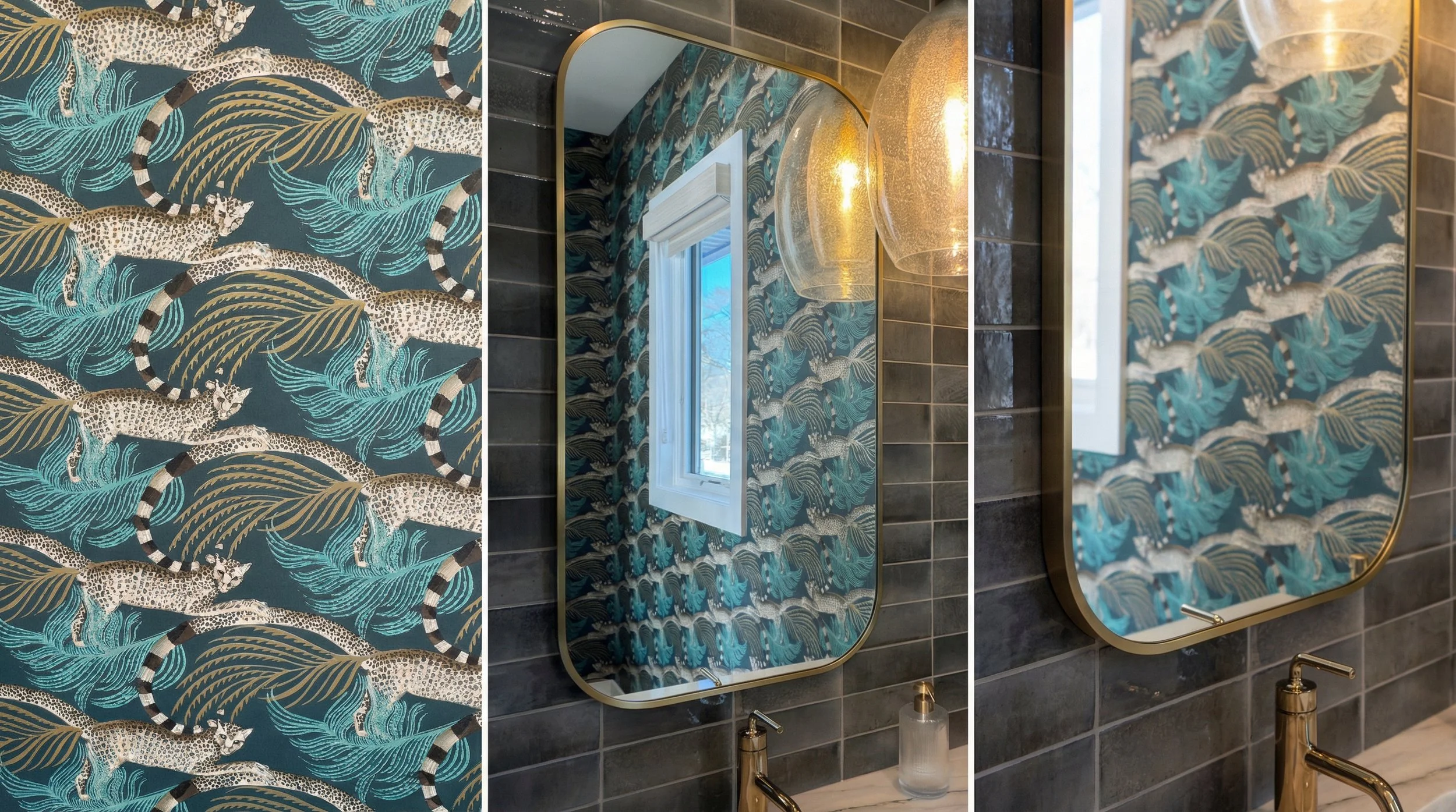
Recent powder room design by KED Interiors
Moving Beyond White as the Default
Minimal white interiors once signaled restraint and clarity. While they offered simplicity, they often relied on contrast rather than depth.
Today, we are choosing palettes with more warmth and more dimension: chalky limestone, softened clay, weathered linen, earthy mushroom. These tones absorb light rather than reflect it sharply. They soften architecture and create a quiet backdrop for furnishings and art.
In custom homes, these layered neutrals allow millwork, stone, and upholstery to feel integrated rather than isolated. In lake homes, they mirror the surrounding landscape, creating continuity between interior and exterior.
Color shouldn’t be trend-driven; it is structural.
Color as Atmosphere, Not Accent
Bold color has returned, but not as spectacle.
Deep reds, mineral ochres, muted greens, and sun-warmed tones are being used very intentionally. Our design team is pulled toward shades grounded in texture and patina rather than gloss and contrast. These hues anchor a room rather than overwhelm it.
When introduced early in the design process, color informs:
Cabinetry tones
Stone selection
Wood species and stain
Upholstery textures
Lighting temperature
Selecting color after these decisions limits its impact. Integrating it early allows materials and furnishings to evolve cohesively.
Color becomes atmosphere rather than punctuation.
The Role of Light in Color Planning
Color cannot be separated from light.
Natural light shifts throughout the day. Artificial lighting alters undertones. Ceiling heights and window placement influence how saturated a pigment will feel.
In whole-home design, light tones are often used strategically; on paneling, millwork, secondary walls, and built-ins to balance depth elsewhere. They act as supporting layers, grounding stronger hues and softening transitions between rooms.
This layered approach creates flow across an entire home rather than isolated statements within it.
Why Whole-Home Planning Changes Everything
Color decisions made room by room often feel disjointed. Even beautiful palettes can compete when they lack a cohesive framework.
Whole-home planning considers:
How one space transitions into the next
How warm and cool tones balance across levels
How millwork colors align with flooring and stone
How furnishings reinforce architectural choices
In custom builds, this integration must happen early, while elevations, lighting plans, and materials are still flexible. In rural or vacation homes, where natural surroundings influence interior tone, early color planning ensures harmony rather than contrast.
When color is architectural, the home feels settled from the moment it’s complete.
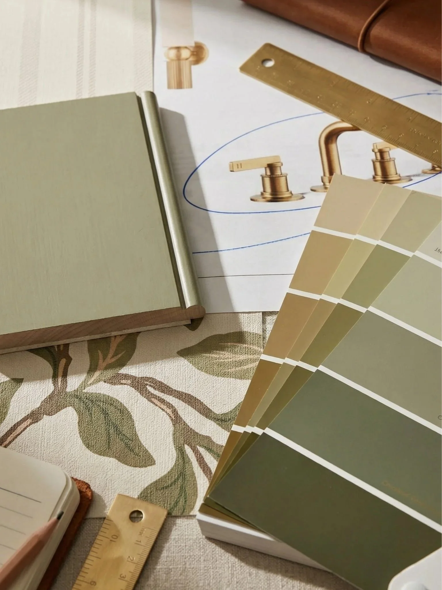
Recent schematic design in progress by KED Interiors
Designing for Depth, Not Drama
The new language of color is measured and confident.
It favors depth over brightness. Patina over polish. Atmosphere over contrast. These interiors are not designed to impress at first glance; they are designed to hold attention over time.
Warm neutrals layered with earthy reds. Muted greens paired with limestone. Soft mineral tones applied to millwork. Each choice builds upon the last.
This is not about abandoning restraint. It is about redefining it.
Color as Part of a Complete System
In full-service interior design, color is never approached in isolation. It is developed alongside layout, materials, furnishings, and lighting as part of a comprehensive engagement.
When planned holistically, color:
Enhances spatial flow
Supports proportion
Strengthens material relationships
Evolves gracefully over time
The result is a home that feels cohesive, grounded, and quietly expressive — a home that feels alive rather than assembled.
In the new language of whole-home design, color is not decoration.
It is architecture at its most human.